In every marketing book out there you’ll see the same advice.
Sell The Benefits
And it makes sense.
People buy the benefits not the features.
So naturally conversion rate optimization experts follow basic marketing rules.
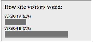
And as we can see from the voting results below from Which Test Won, 75% of the conversion rate experts, myself included, voted for Version B, the one that included the benefits.
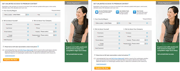
Well, in a recent A/B test for a lead generation test where SAP removed the benefit bullets had an 11% increase in leads via form submissions vs. having the benefits. See the winning version here.
The experts are not always right – And That Is Why We Test
The added benefits to registering for access to content such as white papers, online events, videos, etc. can be seen below:

Now at face value benefits vs. no benefits is not exactly fair to judge which will increase conversion. Rather we shouldn’t really be guessing, we test. It’s not only a question of which ail win but why and how those treatment elements were represented and positioned for optimum conversion rate lift.
Let’s take a look at why the benefits might have lost
First off they are at the top and they do look like buttons, perhaps a usability problem?
Second, they may be getting in the way of the action of filling out the form. Because they are at the top they might be slowing visitors down adding cognitive load to their decision-making process. Perhaps they would be better and serve more of a truly supporting role if they were on the side out of the eye path of the form.
Third perhaps the benefits missed the mark and they are not in line with the reasons why a visitor would opt in?
What else can be tested to continue to improve conversion rates?

For one, the supporting element to the right of the form as mentioned above, the benefit element should be tested vertically in this position.
But the element itself of the woman is not supporting the value proposition of this offer in any way. Lots of room to improve and test here.
My hypothesis is that if the image bolsters the perceived value, that is the copy in the bottom green section, by showing what you get might gain another 2-3% lift alone.
![]() Additionally, the call to action button is weak and simply states what you’re doing “Register” It looks like they did put in some effort when crafting the button though they added the word “Now”. If there was ever a place to add benefit copy it would be in the button. Don’t register me, but rather grant me instant access.
Additionally, the call to action button is weak and simply states what you’re doing “Register” It looks like they did put in some effort when crafting the button though they added the word “Now”. If there was ever a place to add benefit copy it would be in the button. Don’t register me, but rather grant me instant access.
An additional variation to the button could be size. A bigger target means it’s easier to hit.
Below is a close-up look at the second part of the form itself.
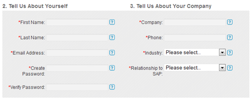
It’s a two-column form which can cause some usability issues if it were longer, but still it forces your eye path and decision flow to be interrupted once you get to the end of the fields in the left column. A future test might include a single column here or even splitting the form up into two separate pages.
There is a lot to test here and as we can see based on the voting results, our gut is not always the best judge at what will win. Had SAP not tested this they would have lost 11% of the opt-ins.
And this is why we test.
I hope this post gave you some ideas on what you could test.
If you are still struggling for an answer to what to test, leave your web page in the comments section and I’ll include it in a future post with ideas for you.
Happy Testing.
Breakthrough The Supplement Revenue Ceiling
This diagnostic reveals the specific bottlenecks limiting your supplement brand’s revenue growth and provides a clear optimization pathway for breakthrough.
Listen to the Health Supplement Business Mastery Podcast for for dietary supplement entrepreneurs and marketers.
