
Designing a dietary supplement label that’s FDA-approved is the easy part. How to design a supplement label that sets your product apart is the real challenge.
Due in large part to the FDA Supplement Facts Label Requirements that must be on the label.
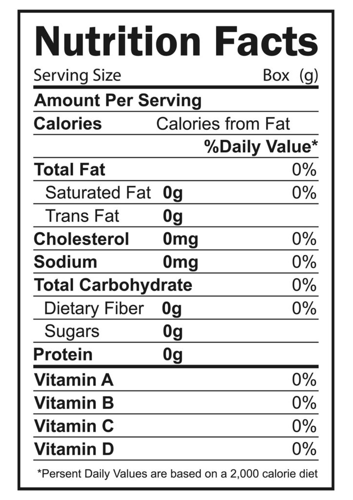
Here’s what’s required for all dietary supplement labels, in the supplement facts section.
What is required on a supplement label?
In short you’re going to have to have a panel on your label that has to have directions and supplement facts and also warnings and your adverse event and your address information and that sort of takes up one side. Here’s a quick hit list of what’s required.
Serving Size Information – How much is one serving, and how many servings are included?
Total Calories – The number of calories per serving.
Name and Quantity of Every Ingredient – Each ingredient in the supplement gets listed here. Quantity measurements are to be listed in IU’s (International Units).
Calories from and Types of Fat – Calories from fat, total fat, saturated fat, and cholesterol must be listed. If your supplement contains any measurable amount of trans fat, that information must be placed directly underneath the listing for saturated fat.
Percent Daily Value (DV) on Dietary Ingredients – The FDA requires that you list the quantities and percent daily value only for the following ingredients: sodium, total carbohydrate, dietary fiber, sugars, protein, vitamin A, vitamin C, calcium, and iron. Listing this information for other ingredients is voluntary.
Common Names Only for Ingredients with No Daily Value – If a daily value hasn’t been established by the FDA for an ingredient, its common name must be used.
The FDA.gov website has a comprehensive dietary supplement labeling guide for regulations on labeling and packaging.
Listen to the episode of Health Business Mastery that covers the topic of supplement labels in more depth below.
How To Design a Dietary Supplement Label
Label packaging has a big impact on supplement sales. As soon as we see a product, we make certain distinctions about it psychologically. Everything from the visual appeal to the quality of the ingredients and the trustworthiness of the brand.
Supplement label design is very tricky to get right. For one, you have very limited in space because you have requirements from the FDA that you have to have on the labels.
Plus the size of the actual label itself is pretty small compared to the number of things that you need to get on it.
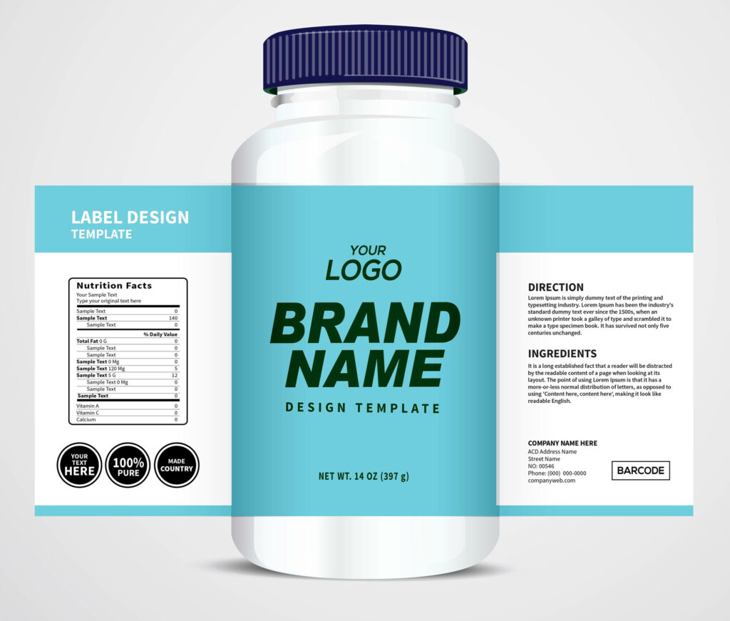
When considering a supplement label as part of your marketing strategy you should consider your market.
Who you’re selling to, most of the time for dietary supplements in women aged 45 and older.
A good label for that market is going to be very different than a label designed to sell to a pre-workout guy at the gym.
He’s looking for a shinier label or a black label that has a more masculine feel. Silver labels were popular for a little while in this space.
According to Vin Tricarico, the Vice President of Contract Manufacturing at NutraScience Labs.
“Over the last 20 years that I’ve been in the industry, certain concepts hold true and other ones have gone completely gone away. And you bring up a good one in the sense that how the sports nutrition space specifically has kind of evolved over the last five years you want to say. If you go back to like 2010, 2009, it was big, it was bold, it was yellow, it was shiny, it was that real glamorous feel. Everything was to be as big and bold as possible.”
Changing Design Trends in Dietary Supplement Labels
Supplement labels are like fashion, changes with time. What’s really appealing is minimalistic design, muted colors, and, simple fonts.
Consumers in almost every segment are buying supplements with labels that have a clean look.
However, the niche that you’re targeting matters.
As the younger Millennial generation preferences of supplement products are completely different. They want a more sustainable product. They want to more bio-compostable products. And a label that reflects that, is going to be very, different. But I think it’s essentially going to come down to a very clean look and maybe different color palettes.
Simplistic but meaningful is key when it comes to the front panel of the label. The front panel, shouldn’t be crowded. Consumers should be able to pick up the bottle and understand what they’re getting.
Things like gluten-free and vegan and recyclable paper are some of these are really important areas that consumers are looking for.
Expressing that in the most minimalistic way is important. An easy way to do that and maintain that clean look is to use icons. Using the same icons across your entire brand helps to maintain consistency across your brand.
But not only icons for supportive information but also the main purpose of the supplement. This labeling strategy gives a visual representation of what the product is for. It simplifies the decision-making process within the consumer’s mind. They immediately “get it” and know what that particular product is for.
Dietary Supplement Label Pitfalls
A lot of brands fail because of great ingredients and they focus on that to the point of becoming too wordy with big scientific words on the front of the label.
And consumers are looking for, is does this connect to me and what they’re looking for. This is why it’s vital that the message is clearly conveyed in a way that your niche needs to see it and be able to immediately get it.
Two-dimensional illustrations are really popular right now probably because they are simple and less cluttered.
Always remember that the person you’re trying to appeal to has got a lot of choices to choose from. And being simplistic right now seems to be the best way to attract them.
If you’re going to look to get your products on the shelf, you want the potential customer to see that all of your products are related, and that it is the same brand. And you want to have the core values of your business speak across all the different products that you’re offering. Because if somebody trusts one of your products and you’ve gained their trust there, when they see something else, they’re familiar with it, they understand it’s the same company, they have an expectation of customer service and quality and all the things that were associated with the product that they are using. And now you have an opportunity to grow what that customer is consuming from you.
Dietary Supplement Label and Packaging Innovations
Areas for supplement packaging innovation But there are factors that affect cost and revenue. For example, supplements in a bottle, vs. a box, and the form factor play a big part in what innovations can be done. Some require dark glass to protect the ingredients from deteriorating. Others are in a powder form ready to pour, stir and go.
Consumers are becoming smarter and are really looking for quality. Subtle nuances can really help a brand elevate its image of quality. One innovation in packaging is the concept of a luxe feel. Some really innovative brand owners are using a design that has different combinations of touch.
For example, you might have a label that has gloss, matte, and soft touch feels all within the same concept, all within the same design. Those different textures, of feel, appeal to the senses. So you’re staking the visual design with the sense of touch to elevate the look and feel of quality. You might use embossing or a matte finish. And then there might be another area on the label where there is a little bit of a shine to it.
That perception of quality on the outside really sticks in the customers’ minds. And that perception carries through from the outside to what’s on the inside in the formulation and ingredients.
Adding a box to your packaging is another way to innovate. With a box, you now suddenly have more marketing space to express your message and image of quality.
Successful brand owners are starting to use packaging innovations to emotionally connect to the consumer. For example, there might be an element of humor. Or there might be an element of a brand owner’s story if someone is utilizing a product or has developed a product because of a health concern that they might have had. Or the brand history, or story or values they stand for. And a box allows that extra packaging space to do these things and more.
Visually, you can carry some graphic elements through so that the customer turns the bottle.
As far as color goes, it feels like it’s been more playful of late as opposed to just plain white or plain black. More brands are playing the white space against the active space. And again, the muted complimentary colors, to the minimalistic design, is sparking interest these days. Using color help you to stand out if you’re on a shelf or if it’s a product image online.
Innovative Dietary Supplement Label Examples
Using QR codes to expand the story is one innovation for supplement labels. It’s nothing new, Gaia Herbs has been using it for years on their labels.
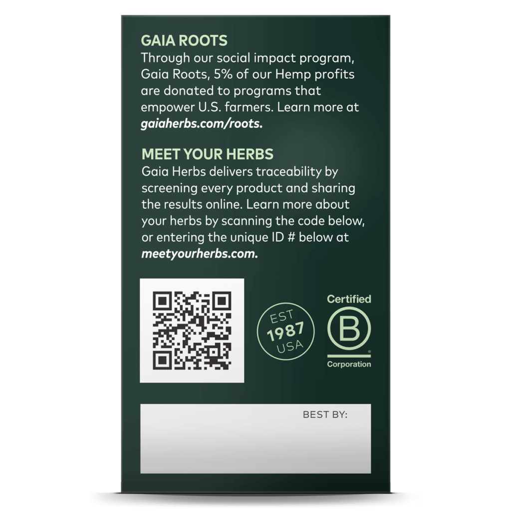
However, QR codes, are more common if you have a box on the back panel. Or on a bottle that comes in a box as opposed to just on a label. Again, space is at a premium. One innovative solution is on the top of the bottle cap. Or as a sticker on the bottle cap.
With a QR code, you can take the buyer to a video message from the founder. Or expand on the ingredients, the quality, and where it’s sourced from. There’s so much potential. The strategy and opportunity here are all about extending that trust and relationship by interacting with a prospect before the sale, especially if they’re standing in the store and there’s a QR code staring at them. Or after the sale for a buyer to bridge that relationship and continue to be a customer, month over month.
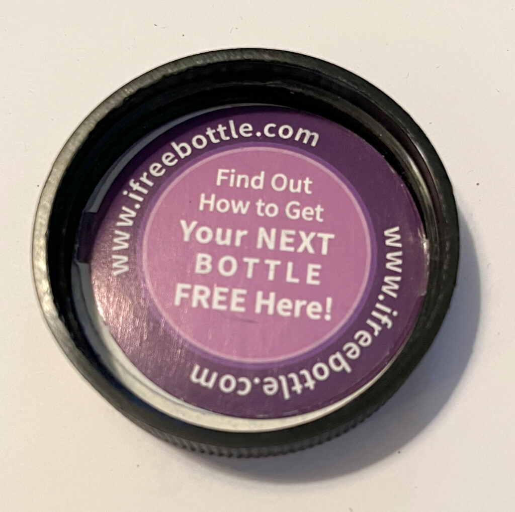
Another creative idea is to use the space under the bottle cap. In the example below, this supplement brand uses this bit of marketing space to get you onto monthly continuity
Label Secrets For Supplements
Packaging is reflecting the marketing sensibilities of today’s audience. And that’s being reflected in label design decisions like, is it a clean design, not a lot of over design. But it’s also not limited to what’s outside the bottle. It also includes what’s inside.
Not a lot of ingredients is working well with an audience under 50. To them, it means the product is being put together in a small crafted kind of way. That gives people comfort. That gives people a feeling of, all right, this is a brand that I want to be associated with, and there’s a trust factor there as a result.
Traditional boomers, don’t really care as much about those things. It will be very interesting to see what happens as the younger buyers today age up, and if that same sensibility stays or if they flip back to the traditional boomer sensibilities.
In Conclusion
There are a lot of essential elements to think about with your label and packaging in the supplement space. There’s a lot of competition and one way to differentiate your brand is in your packaging and in your creativity. Keeping trends in mind is important to know how to differentiate your brand. To summarize, the lux feel of quality where with gloss and matte finishes, and glossy and soft finishes on the same label are hitting well right now. Having a minimalistic design with elements with a muted color palette, simple fonts, and two-dimensional illustrations, gives that sense of smallness, but being of quality is what’s working right now for designing supplement labels that sell.

Breakthrough The Supplement Revenue Ceiling
This diagnostic reveals the specific bottlenecks limiting your supplement brand’s revenue growth and provides a clear optimization pathway for breakthrough.
Listen to the Health Supplement Business Mastery Podcast for for dietary supplement entrepreneurs and marketers.
