When it comes to selling more natural health products online, no matter if they are digital products, physical products or supplement products, there’s one element that is crucial to the conversion sequence.
It does not matter how good your headline is…
It does not matter how good your sales copy is…
It does not matter how good your design and layout are…
It’s your offer that can make or break the sale.
That’s why many nutritional health and supplement marketers spend a lot of time on crafting the offer, or at least the good ones do.
A strong offer can overcome a lot of conversion sins on a landing page.
But, there’s more to an offer than the offer itself.
What’s often overlooked when it comes to offers is the presentation of that offer itself.
With the proper attention given to user experience (UX) eye flow (design) and persuasion, a strong offer can become super powered and vastly increase revenue.
When it comes to conversion optimization for the health market, the offer has the most weight when it comes to growing revenue.
Which is why the offer,in and of itself, deserves it’s own split-testing and optimizing, as a single variable cluster test.
Let’s look in-depth and dissect just the offer section of a long form direct response online sales letter for a well know nutritional health and supplement company.
You’ll see what they are doing right and wrong and how you can use these learnings to craft a stronger offer for yourself using some key elements of conversion like eye flow usability, design and much more.
The offer we’ll be examining today is for a low ticket digital information product with upsells behind it.
This is the front-end offer to a sales funnel that is targeting a broad market that has a low market sophisitication and is used to pull in new buyers.
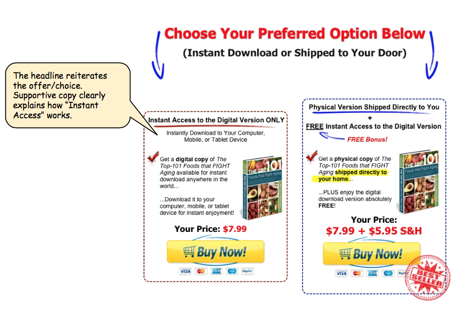
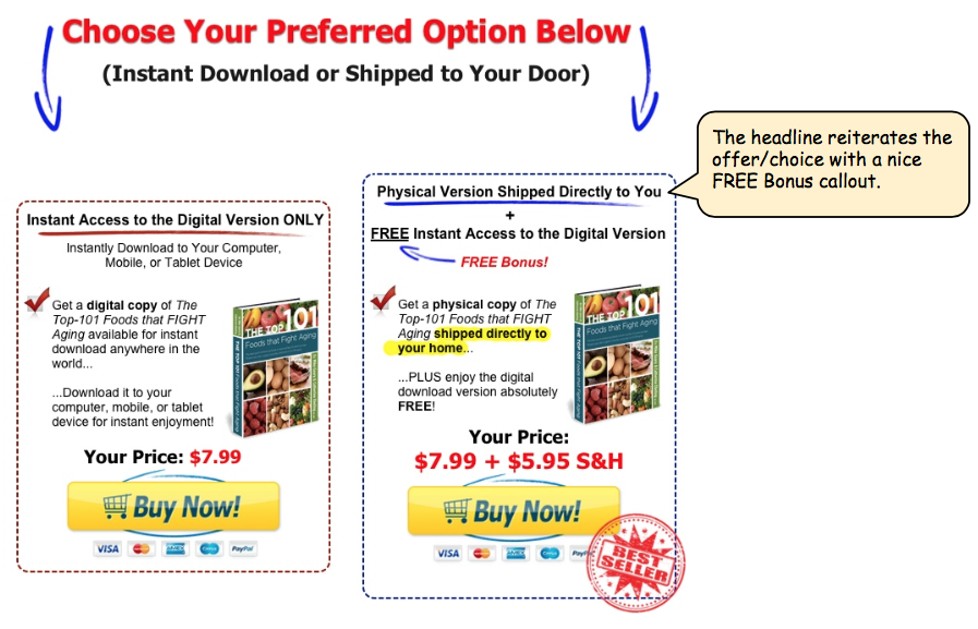
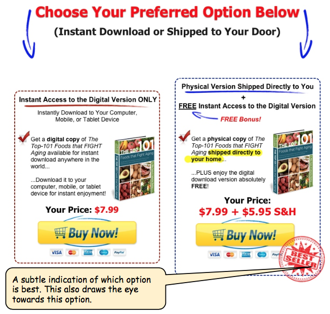
The first element of the offer is the “Offer Headline”
There is very clear language here. Directing the visitor, that is telling him or her exactly what to do.
The Landing Page Offer
But let’s not overlook the supporting text that clarifies the offer itself. Do you want the instant download version or do you want this shipped to your door?
The “Offer Headline” is further supported with arrows directing the eye flow to the next step.
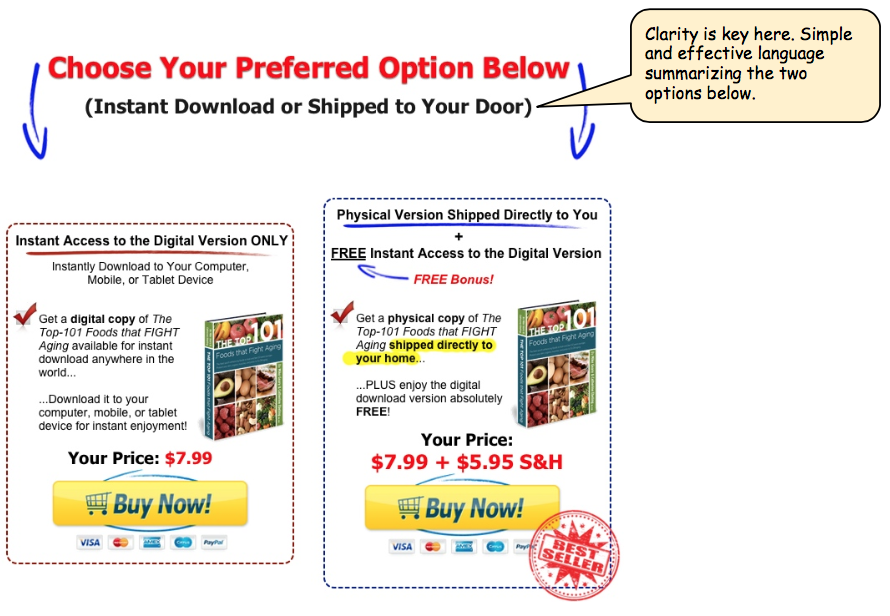
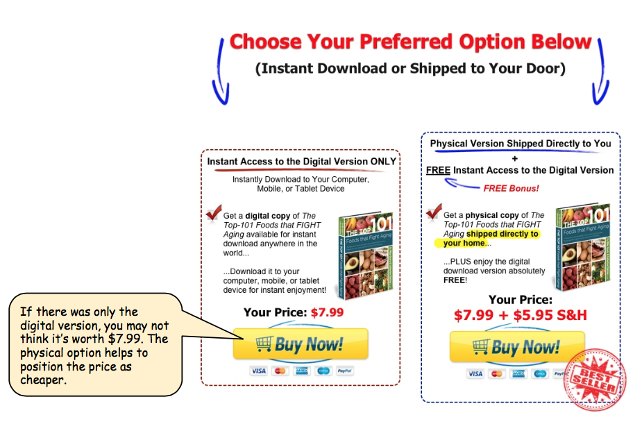
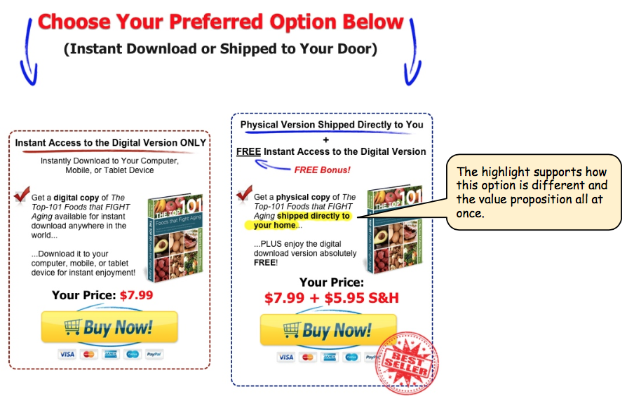
Even though there are two options here, the digital version and the physical version, theres really just one product choice, you’re just choosing your method of delivery.
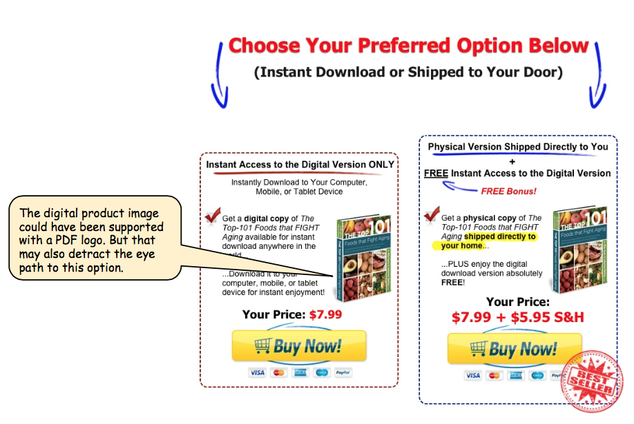
To further clarify the difference one thing this offer could have improved on is adding a PDF icon on the digital version so the visitor could differentiate the two options at a glance, helping them to choose based on delivery mechanism and price.
Most marketers would have probably just simply offered one or the other, but there is a benefit in offering both at the same time side by side.
If there was only one option you may not think it’s worth the $7.99
The physical version helps to position the value of the product, raising the perceived value of the downloadable version alone.
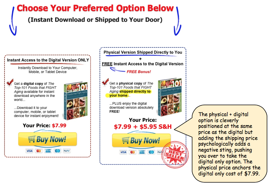
And the additional shipping cost of the physical version is off-set by including the digital version with that option.
There is more going on here than simply offering a more convenient option with the physical. What this offer is also doing is clearly dividing the buyers into higher value customers, those who are willing to pay the extra $5.95 shipping and also those that have a higher propensity for physical information offers.
The shipping cost also pushes those that are more price sensitive to the digital version, making it the cheaper option.
Now that you understand what’s going on under this offer you can take what this offer is doing well and apply it to your marketing today, or better yet, test it.
Breakthrough The Supplement Revenue Ceiling
This diagnostic reveals the specific bottlenecks limiting your supplement brand’s revenue growth and provides a clear optimization pathway for breakthrough.
Listen to the Health Supplement Business Mastery Podcast for for dietary supplement entrepreneurs and marketers.
