 A health buyer is very different from other types of buyers online.
For one the amount of trust they need to buy from you is much higher than other types of products. Plus the prospective health buyer’s own personal beliefs play an important role in their decision.
But a third and often overlooked is a third factor. And that is the value of the product / offer itself.
Understanding the value people get from a health product is vital to proper conversion rate optimization for health and wellness products.
And when selling anything online, especially a bottle of supplements or a health information product, the KEY is to express the value of the offer.
The reason for this is because the offer is the highest leverage point of any sale. And the value of that offer is all you have online to concisely encapsulate what your prospect is getting.
But let’s not forget your offer is what the prospect is buying and it needs to be built on top of a strong offer. Click here to get 12 free offer templates you can use right now.
Many times health marketers will simply lead with a long form sales letter explaining the offer and then add a buy button at the offer point.
Or they will list out each bonus one by one giving each a paragraph of text and then present the main product with a buy button after the premiums. But this doesn’t express the full value of the offer.
Think of the “value of the offer” as the visual expression of the value proposition.
Whereas the value proposition can be stated in text, in a headline, the value of the offer is expressed mostly through pictures and supported by text.
The principal distinction here requires a shift in thinking and that is this…
People DON’T buy products online, they buy IMAGES OF PRODUCTS online.
So… the image of the offer is an expression of the value they are buying.
The offer image needs to:
- Summarize the complete offer.
- Be designed to really sell the value through the image itself.
Let’s look at an example for an offer selling a digital cookbook with some other bonus digital ebooks premiums added on.
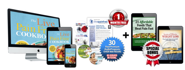
In this example left side of the image shows the cover of the cookbook on 3 different devices, a desktop, a tablet and a phone. This offer could have just as easily showed only one or showed an image of the physical book.
Showing the physical book would have given false expectations, since you’re not getting a physical printed book but rather a digital version.
Showing the book inside of the digital format gives you a concert sense of exactly what you’re getting. We could have just as easily showed the physical book with a digital PDF/Mobi Format callout on top indicating that you’re getting a digital version of this book but that wouldn’t have expressed the true value of what you’re getting. Nor would just the ebook inside a tablet.
By showing the ebook inside all three devices, desktop, tablet and phone, the value of the offer for the ebook has increased. Now the buyer can easily imagine reading the book across all three devices and the perceived value of the book itself has been amplified.
What is perceived value? It is simply the answer to the question, how much is it worth? The “worth” a product has in the mind of the consumer is entirely subjective.
For the most part, consumers are unaware of the true cost of things. They simply have an internal feeling for how much certain products are worth to them based on similar products. In this case they don’t normally see a digital book in several formats played out like this, that value is usually implied. Here it is explicitly expressed and called out, increasing the perception of value.
Additionally the information in the cookbook itself is an unknown and something that can and should be amplified in the sales page copy and could be supported in a bulleted summary along with the image above.
We can’t complete our discussion of the value of the offer without talking a bit about the premium bonuses you get. In this case you get two additional digital books for free. Adding additional digital content to any offer is a great way to increase the perceived value and also not increase cost of goods.
But What About The Price?
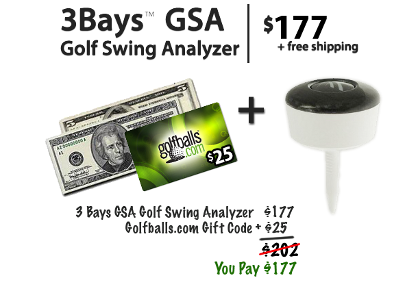
So far we’ve just discussed the presentation of the product but the full offer includes not only the product and the bonuses but also expressing the value of the price.
Rather than jus simply presenting the price, one thing you can do is offer the product at a discount and show the regular price slashed out next to the price you pay. There are other ways to do this like express the savings as a percentage discount or a dollar off amount.
I wouldn’t include all three though. In that case there would be too many numbers and this might cause confusion in the mind of the buyer.
Going One Step Further
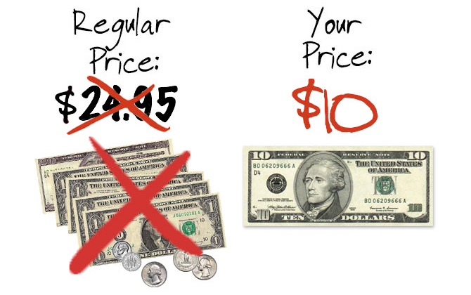
What if you really wanted to intensify the perceived value of the discount further? You might choose to show the regular price and your discounted price in terms of what it would look like in actual money. So rather than simply show the dollar amounts as text, show a fanned out pile of bills of each amount.
The key here is to make the perception of regular price of fanned out bills look like more. You can do this with the choices of bills you use. For example the regular price of $20 can be expressed as a single 20 dollar bill or two 10 dollar bills. Having two bills will be perceived as more expensive.
An advanced technique is to intensify the value of the offer by positioning the discount as an instant coupon with nothing more than an image.
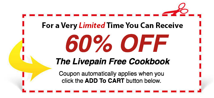
All you need to do is simply add an image like this one that shows the percentage discount and states that the coupon automatically applies when you click the add to cart button. In the ideal case you’d want to show that discount in the cart, with the exact dollar amount they are saving and some reference to the coupon being applied.
But there’s no reason why you can’t simply A/B test this as just an image on the sales page with nothing more. This will tell you if it works for your audience without the programming work in the cart. If it moves the needle significantly then it might be worth it to spend the time with your programmer.
How To Position Shipping
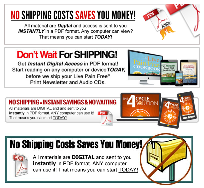
Let’s not forget that the offer itself is for a digital product so as a consequence, there is no shipping, it does not need to be delivered in the mail, and the buyer gets instant access to it immediately.
Rather than these being a negative, at least for an older audience, and not calling any attention to them, each of these benefits can be expressed in the value of the offer. Again simply with how you present the offer. Here’s an example.
A Framework For Measuring The Value Of An Offer
You’re now armed with the basics of increasing the perceived value of the offer. Remember, the offer is the highest leverage point of any sale.
To take it one step further, below is a simple framework you can follow to rank each of the main elements on a subjective scale of one to five.
1. How Well Is The Complete Offer Visually Represented?
2. How Well Does The Visual Representation Clearly And Fully Express The Value?
3. How Well Does The Expression Of Price Sway The Buyer?
4. How Well Is The Expression Of The Shipping Presented?
5. Is There A Clear And Powerful Guarantee?
With one being the weakest execution and five being the strongest. Then simply add up your score to see where your offer falls on the value framework.
A score of 5 – 10: You have a lot of opportunity for improvement
A score of 11 – 14: You’re at a good starting point, run with it and see how it does but test an alternative soon.
A score of 15 – 25: You totally nailed it, keep testing to see if you can adjust the perceived value even more with different treatments.
Just realize you can always make improvements no matter where you are on the scale. That is why we continue to split test and optimize.
But even if you express the value of your offer perfectly, you have to build that value on top of a solid offer structure. Click the button below to get your free offer template that you can start using today.
There Are Three Funnels Every Health Supplement Business Needs To Build A Multi-Million Dollar Empire…
The problem is most dietary supplement companies only have one funnel. Through our work in the online health space, we’ve had the opportunity to observe hundreds of health businesses. What we’ve uncovered are the three critical funnels that each work together that make the difference between the average supplement company just selling on Amazon and a multi-million dollar health empire and compiled our findings in the book below. Click here to get the ebook delivered right to your email for FREE.