“Do long form sales pages really work?”
The clients question hung there daring me to answer.
“It’s way too long. No one will read that much”, he said.
He couldn’t have been more wrong.
To the untrained direct response marketer, these lengthy sales pages do seem ridiculously long, ugly and cheesy. But direct response marketers know the secret of how they work. Which is why they use them both online and offline. because, they are exceptionally effective when done right.
Why do they work so well? I will give you a hint- It’s not about attention spans.
People have infinite attention spans if you’re engaging them at the heart of their biggest problem.
And it’s not about reading every single word.
Prospects will read as much as they need to, in order to convince themselves to buy. Some will read more than others, some less.
However the biggest misconception that most direct response marketers have is that they think the reason these long form sales letters work is because of the copywriting. If the words are persuasive enough, then people will buy.
But readers of my articles know there’s a lot more to it than just persuasive words. For one thing, the offer has more weight when it comes to the success of a long form sales page. And secondly, the sophistication of the marketplace is also a big contributing factor to the approach. Thirdly, design plays a big role to helping a reader consume the message.
There is one fundamental principle for sales letters, no matter how long or how short it is: If they don’t read it, they won’t buy.
Now it’s true, people generally don’t read every word of these long form sales pages (that’s not the goal). They are skimming. Reading certain sections and glancing over others.
Since people of this demographic, use their mouse to track what they read, you can see from heat maps where they read.
When we split test completely different copy against a control, you can get a view into how people are reading your sale page. Here is an example of what we commonly see with copy tests.
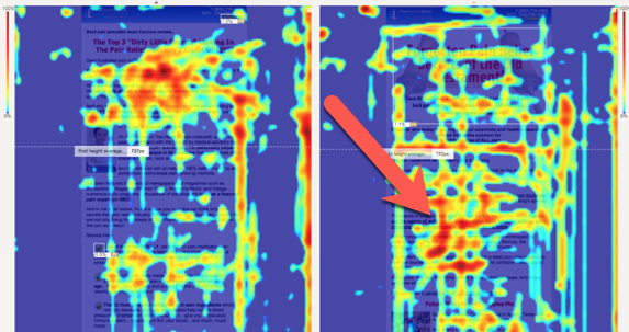
You can clearly see in the control on the left, more people are reading the top lead in copy then skimming the copy below it, as indicated by the big gap, until they start reading again, on the bottom third the page.
Contrast that to the treatment copy on the right in which we see a more evenly distributed heat map over the entire section of the page with a particular intensity towards the middle section, where the arrow is pointing.
The data here is telling us that the treatment copy is more engaging, especially around the hot spot sections.
The Missing Sales Page Principle
Just because long form sales pages work, does not mean all you need are more words.
Words work in conjunction with images and layout. In fact, there is no copy that can’t be improved with good design.
But good design is a lot different than what a top notch wiz-bang designer can whip up.
Direct response is a different kind of design all together. Long form sales pages are use as a tool within direct response marketing.
In the direct response world, often times ugly design can work better than getting too flashy.
The reason why, is that flashy design has a tendency to distract the reader.
Yet we see so many ugly long form sales pages online, where very little effort has gone into the deign, because of the belief that “copy is king.”
Many direct response marketers believe that if the copy is good, it will convert no matter what the page looks like. To a degree this is true, but NOT entirely.
Another reason this happens is speed.
It’s just plain faster to get an ugly page up than it is to design a good one. If the page converts well as an ugly page it will convert even better if direct response design is properly applied.
But… Beware Of The Long Form Sales Page Pitfall
Not many people can tell a well designed long form sales page over another. Once the design is pretty enough, the untrained eye just sees it as a good page.
I can tell you first hand from owning a direct response optimization agency that it is absolutely possible to over design a page and have it convert WORSE. Not just any designer can make a long form sales page better with just design.
The problem is, most approach the problem from a design perspective and not a marketing perspective. It’s NOT about making it pretty. It’s about knowing where to emphasize the copy and where to chunk it together and when to not.

Here’s an example: This layout makes two critical mistakes.
The first, is in the top graphic section, including up to the yellow background area.
The text above and below the headline is so subtle that you completely miss both of them.
But the bigger mistake here is that the bullet points in the yellow area are separate from the headline.
The distance, alignment and color background makes the bullets a completely second thought rather than continuing as all one thought.
Imagine the copy as a conversation and each section is a pause. As it is designed now, it just does not flow as one thought.
The second critical mistake lies in the flow of the copy near the two images of the women lifting the tire and doing a pull-up.
These images break up the copy at a point where you want to answer the question created in the readers mind. Which is answered in the copy below the two images. But the placement of these images acts as a speed bump, slowing down the reader and breaking that flow.
In this example the designer made the page pretty enough but failed to take into account the flow and sequences of the copy.
In this revised design, below you can see how these mistakes have been corrected.
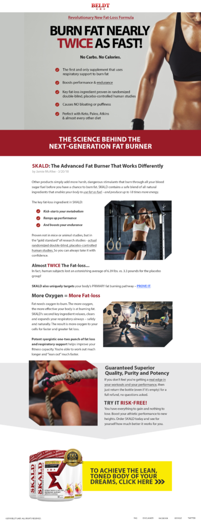
Notice the way the entire top section has been completely redesigned. Everything up to the sub-headline in the red background reads as one thought.
The eye brow copy above the headline stands out just enough but not too much.
The copy below the headline “No Carbs. No Calories.” flows right from the headline into the bullet copy. It’s all one straight line down the page. Keeping you in that one frame of mind before transitioning you with the sub-headline knockout text against the red into the details of how it works.
Furthermore, the copy break in the first design is corrected and moreover, easier to read through the use of side images making the copy width much narrower. Which makes it scanable and easier to read.
All leading to the bottom section in gray, which is purposely treated as a separate thought. Including a visual arrow cue, drawing your eye right down to the call to action.
How To Make A Sales Page That Converts
Let’s take a look at the top of some long form sales pages and what’s working in them.
In this first example, the headline is broken up into three distinct chunks. (indicated by the the arrows in the image below)
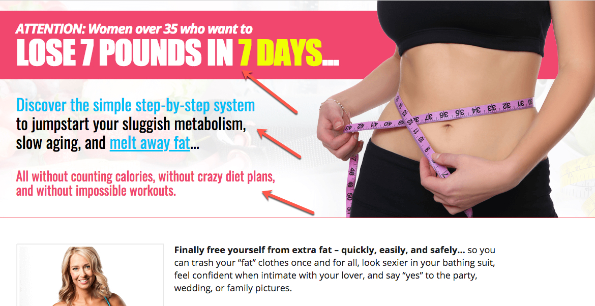
Breaking it up this way makes it easier to scan. In addition to separating each into completely different thoughts. The designer makes excellent use of space between each one, in addition to using color to break up each section. Each section of copy is a different idea.
It’s no accident that the first section along with the benefit and promise “Lose 7 Pounds in 7 Days” is the largest and most prominent. This is easy to read, grabs your attention and draws you into the next section which begins to answer “the how”, implicitly stating what you’ll learn if you keep reading.
Followed by the pink line of text, again separated out, that both creates curiosity and removes objections with the copy: “All without counting calories, without crazy diets…”. This copy almost begs you to keep reading to find out how, all while making it easy to read quickly.
In this next example below we see the same use of color, space and size to make the text easily readable, chunking each thought into its own group.

Again this follows a similar design strategy. The big promise “Never Diet Again” is bigger than any other text, bold, all on one line in a different color and quickly read. Leading you to the next section of copy in blue. Which again peeks the curiosity by answering what the rest of the page will answer.
And again followed by the reversal, which removes objections and at the same time intensifies the curiosity.
It begs you to keep reading.
All while masterfully breaking up each section through the use of good direct response design.
Let’s take a look at another example:
It’s easy to imagine how the copywriter must have presented the text as one block:
Break All the Rules – and Get Lean Fast!
Lose 10 or more pounds in just 2 weeks!
Introducing the ultimate FEEL FULL eating plan that lets you…
Notice how the designer used size and color to break them up.
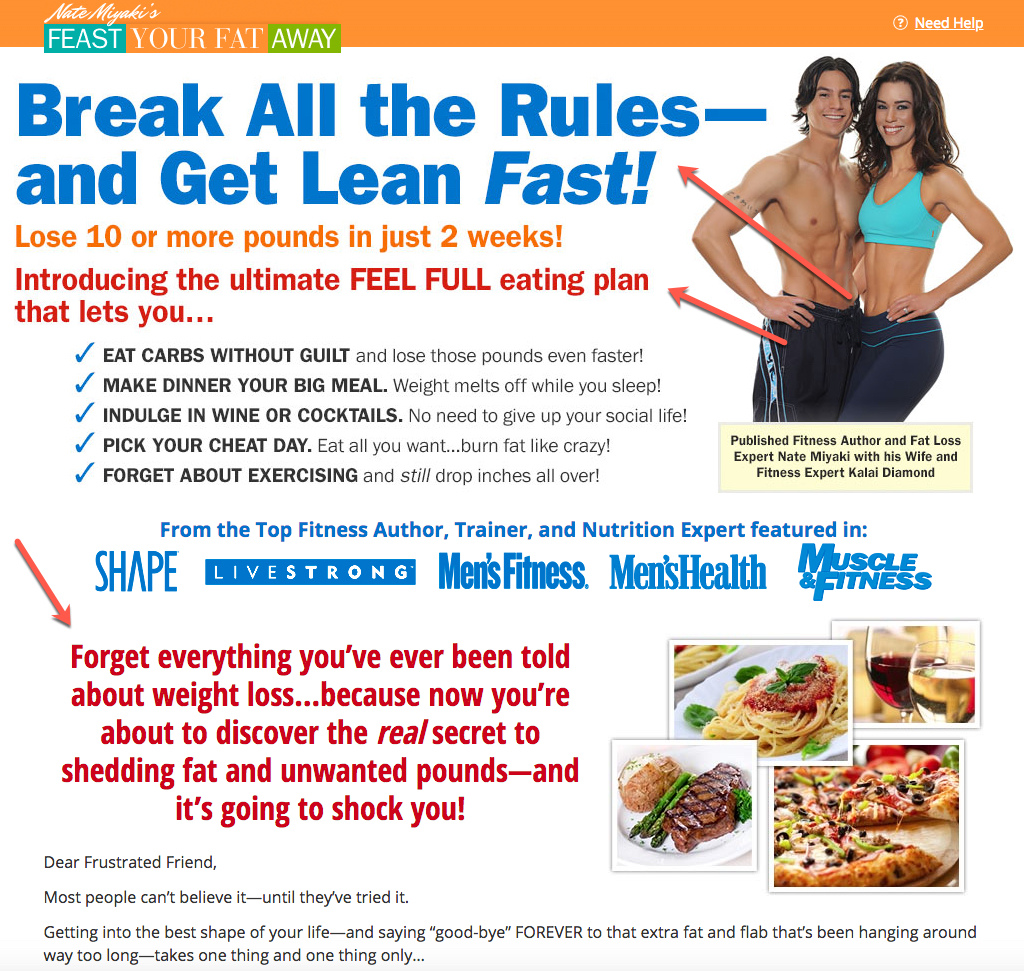
Even the check mark bullet point copy makes great use of bolding and caps to easily scan each point quickly. The sub-headline at the bottom “Forget everything you’ve ever been told about …” acts as a continuation from the top sub-head tied together through the same color and font size as the sub-head above.
But it doesn’t have to be fancy.
Ugly Long Sales Pages That Convert
The next two examples are very plain and rather ugly compared to the previous examples.
But it get’s the job done with a nice big bold headline on two lines. (Three lines for a headline should be the max you should use.)
The check mark bullet points visually separate the top section from the start of the sales copy below.
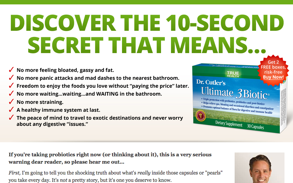
Here’s another ugly example that uses color, space text size and layout to visually break up each section in an easily readable format.
Notice how what would have been a 4 line headline is cleverly broken up into 2 lines each and distinguished by use of color to aid in the readability.
Again each section (the eye brow above the headline, the headline and the bullet points) each read as a single thought through the use of color and size to separate them as independent parts.

Long Form Sales Pages Tend To Be Really Long…
When you have so many words for a prospect to read, the most important thing you have to design for is readability.
In this example below, there are a lot of key long form tricks at play to make this page section below work.
First the use of green sub headlines break up the copy sections.
Second, the product image is at the first point it’s mentioned in the copy. The copy in that section is narrower, making it much easier to read.
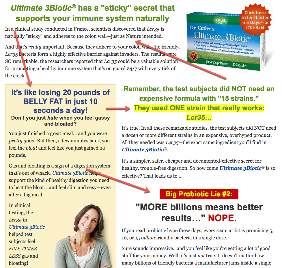
Also notice how the yellow shaded sidebar is doing the same thing, making the copy narrower so it’s more easily readable and scan-able then it would be if the copy were the full width of the page. This is a great technique for long form sales pages. Sidebars can take up a ton of vertical space, and help draw the readers eye down the page.
In the second sub-headline: (Remember, the test subjects did NOT need an expensive formula with “15 strains.”) they chose to highlight the second half of the sub-headline (They used ONE strain that really works: Lcr35) not only because it helps to break up the length of that sub-headline but also because it’s the most important part of the sub-head.
And finally the (Big Probiotic Lie #2) visually sets that section off as different along with the treatment of the sub-headline (“MORE billions means better results…” NOPE) visually differentiates the next section of copy. This makes it visually interesting compared to the green sub-headlines above in the previous sections.
Long Form Sales Pages Are Exactly As Long As They Need To Be
Long form sales pages work even though people don’t read every word. The key is in the flow of the layout as much as it is the copy. But there is an art to it that is not evident at first glance. To the untrained eye it just looks like a really long page or worse an ugly page.
It does takes more work to evaluate a long form sales page. It’s just as much an effort to know what good copywriting looks like as it is to know what design elements to tie into the copy. They go hand in hand.
You could get by relying on the strength of the copy alone but a proper long form sales page design can intensify the results of your copy, and get you a conversion lift with just design.
In closing here are several principles we use every day to design long form sales pages that convert customers.
- Large font size (especially in the health space with an aging audience, I recommend 18px minimum for body copy, larger for headlines.)
- Short lines of text (Ideally 80 – 90 characters per line)
- Short paragraphs (every 3 -4 lines)
- Use sub-headlines to break up sections
- Expandable / collapsible information – Open info in a light box to cut down on overall length but be careful not to upset the flow and copy argument, which is critical to conversion.
- Strategic use of images to break up large blocks of text (But make sure the images support the context of the copy and amplify the message.)
- Images and design cues such as sections and horizontal rule lines should be used as “visual speed bumps” to slow down people from speed scrolling and nudge them to read.
- Make use of white space so it does not seem like such a chore to read.
The most important thing to remember when designing long form sales pages is that the flow of a long form sales page is the key to getting people to consume it. It’s the job of both the copy and the design to get the prospect to read. If they don’t read it, they won’t buy.
Breakthrough The Supplement Revenue Ceiling
This diagnostic reveals the specific bottlenecks limiting your supplement brand’s revenue growth and provides a clear optimization pathway for breakthrough.
Listen to the Health Supplement Business Mastery Podcast for for dietary supplement entrepreneurs and marketers.
