 When thinking about conversion rate optimization, it’s best to think in simple terms. People need to know what to do. In fact it’s one of the core three questions every website needs to answer.
1. Where am I?
2. What can I do here.
3. Why should I do it.
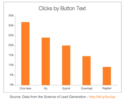
Being crystal clear and direct is the key to increasing online conversion rates. The data in this study from Hubspot shows copy options on several call to action buttons. You may not find the same results work for you and this is in no way a definitive rule, you should always test with your audience to determine what really works for you.
But one thing is for sure, if you want to increase your conversion rates your call to action buttons need to be utterly clear. For example, “Click Here” may not be sophisticated but it is explicitly clear. When compared to Go, Submit, Download and Register it won out in this study. Click here tells the visitor exactly what to do. The call to action Go is ambiguous. It does not tell the user what to do but is more like submit, download or register. Those are actions the program is going to take not clear concise directions for the visitor.
Always think in terms of your visitors and what you want them to do, not what your website or programming will do. Your users come first when it comes to conversion. To learn more about how to convert more clicks into customers contact a conversion rate expert to review your specific needs.
Breakthrough The Supplement Revenue Ceiling
This diagnostic reveals the specific bottlenecks limiting your supplement brand’s revenue growth and provides a clear optimization pathway for breakthrough.
Listen to the Health Supplement Business Mastery Podcast for for dietary supplement entrepreneurs and marketers.
