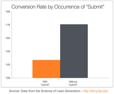
 Time and time again marketers and designers default to using the word “Submit” for buttons. Perhaps because that’s the default when creating an HTML button or perhaps it’s because that’s what is happening on the back-end of the HTML. When a visitor clicks the “Submit” button on a form the information is being submitted to a database. In either case it’s the wrong choice of call-to-action if you want to increase your conversion rates. The data in the Science of Lead Generation study clearly shows the difference in conversion rate from about 14% to 17% without the word “submit” as the call-to-action button.
The word “submit” does not offer any value to your visitors. The question you need to answer when writing persuasive call-to-action button copy that will get visitors to convert is . Why should your visitors “submit” that form and click that button? If you want to increase your conversion rates don’t use the standard “submit” button. Use button copy that re-enforces the value of clicking that button.
Breakthrough The Supplement Revenue Ceiling
This diagnostic reveals the specific bottlenecks limiting your supplement brand’s revenue growth and provides a clear optimization pathway for breakthrough.
Listen to the Health Supplement Business Mastery Podcast for for dietary supplement entrepreneurs and marketers.


Really never thought of that. I thought submit button is the most general button people will click on. I’d better change it to other more convincing wording to replace “Submit” button. do you have any statistics show which call-to-action button has the highest conversion rate?
Thanks Bobby for this great article. 🙂
Glad I could help you look at call to action buttons in a new way Kent. There really is no Hands Down Best button wording, unfortunately it’s not a one button fits all much like any marketing. It really depends on your audience and the value you’re providing. A good rule of thumb is to re-enforce the value of the click with your button copy and as I always advocate, test, test, test.
What other button labels would you suggest to replace “Submit”? Particularly for contact forms/request info/request quote forms?
Blue Horseradish, It really depends on the offer send me a link to the page you’re thinking of either through the comments here or email and I’ll give you a more exact answer. For now I’ll try to answer it without knowing te value each form is offering. For any form, think of it in terms of the value for the person that has gone through the trouble of filling out your form. What will get get out of it? It’s that value that you want to connect with the call to action button. So for a contact form the value might be that a prospect knows how much it’s going to cost him or her. In that case a good call to action button that would beat the socks off of submit would be ‘Get Your Free Quote” or “Get a Quote Now” In both of these examples we’ve leaned on the value of a quote and turned up the dial by adding words like FREE, Now and Your.
Thanks for the insight on this – who knew this word submit had such a flat performance!
thanks again
Okay, thanks for your reply.
I was referring to a general sales inquiry form, where a prospect provides their contact info about a companies services. Those forms typically have buttons labeled “Submit”. They are not getting a quote or buying anything, just making a sales inquiry.
Glad I could offer a new perspective for you Kent. Thanks for reading.
Larry, Every button has an opportunity to move the visitor along without using “Submit” In your example it could be as easy as “Inquire Now” The main take-a-way is to keep the momentum going with benefit specific language rather than the standard “Submit” which doesn’t speak to any benefit and does not help with forward momentum in the mind of your prospect.
Hi Kent,
Thanks for your comment. There is no one button verbiage that works well for every situation, it really depends on the benefit of clicking.
Hi, great article on a great subject. I could discuss and read about this stuff all day. 😉 In reference to your offering a suggestion specific to the site in question, would you mind checking ours out at http://PRLuv.com? I’ve had OK success with it but I want it to be better. It’s only about a week old at this point but with a lot of great feedback, so I’m still experimenting with the exact wording of the slogan before the CTA button, as well as the CTA button itself.
Thanks!
Thomas,
Thanks for commenting.
I looked at the prluv home page main call to action button “Join For Free” Here’s my feedback.
Whenever you offer an incentive you have to be careful not to sell the incentive in-spite of the offer.
The (free Fiverr Gig) incentive is very clear, however, it’s at the expense of the reason for joining. The value proposition for joining is missing. The “Ready for results?
question before the incentive implies results, but it leaves me wondering what types of results? This needs to be answered up front where you have the large rotating splash images. They look good but unfortunately are not telling me anything, they are not giving me a compelling reason to read beyond that. If you deal with the value proposition in that space this would allow you bolster the Call to action button “Join For Free” with the benefit of joining. Virtually switching the Free call out with the results text. So the CTA button could be stronger if it were “Get Results” and if Joining FREE is an important differentiator then you can put it before the Fiverr incentive line. But don’t forget to work on your value proposition. Let me know if I can help with that.